Step 3: Shared root
In this step we keep the landing page from the previous steps and add a dedicated settings root for layout content shared by all pages. We will define a global settings entry which holds information about the top menu or global footer
Other examples you might want to include in this root:
Taxonomy lists (eg. for tagging)
Shared content such as a list of authors
A dictionary of words used across the website that are not tied to a specific page
Under entries we define settings, just like the pages and blocks we split this logic in 2 files. One to define the schema and one to define the corresponding React views.
app/
├ page.tsx
╰ layout.tsx

entries/
├ landing/
│ ╰ ...
╰ settings/
  ├ SiteLayout.tsx
  ╰ SiteLayout.schema.tsx

blocks/
╰ ...

cms.tsx
Define a dedicated entry type for shared layout content used site-wide, and disable preview for this global settings entry. Notice that we use Config.type here, instead of Config.document. We don't need metadata fields on this type of entry.
import {Config, Field} from 'alinea'
export const SiteLayout = Config.type('Site layout', {
preview: false,
fields: {
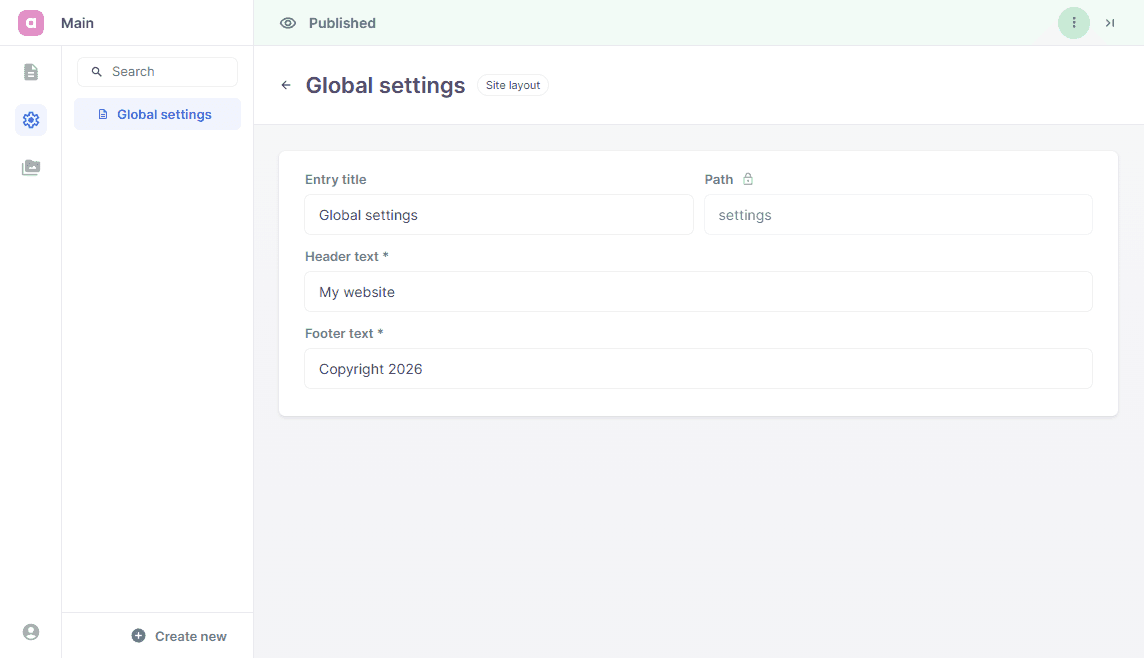
title: Field.text('Entry title', {initialValue: 'Global settings', width: 0.5}),
path: Field.path('Path', {readOnly: true, initialValue: 'settings', width: 0.5}),
headerText: Field.text('Header text', {required: true}),
footerText: Field.text('Footer text', {required: true})
}
})
Create small header and footer components and infer their props from the SiteLayout schema.
import type {Infer} from 'alinea'
import {SiteLayout as SiteLayoutEntry} from './SiteLayout.schema'

type SiteLayoutProps = Infer.Entry<typeof SiteLayoutEntry>

export function SiteHeader({settings}: {settings: SiteLayoutProps}) {
  return <header>{settings.headerText}</header>
}

export function SiteFooter({settings}: {settings: SiteLayoutProps}) {
  return <footer>{settings.footerText}</footer>
}
Register SiteLayout in a dedicated settings root and (optionally) seed one entry.
import {Config} from 'alinea'
import {createCMS} from 'alinea/next'
import type {SVGProps} from 'react'
import {LandingPage} from '@/entries/landing/LandingPage.schema'
import {SiteLayout} from '@/entries/settings/SiteLayout.schema'

export const cms = createCMS({
  schema: {
    LandingPage,
    SiteLayout
  },
  workspaces: {
    main: Config.workspace('Main', {
      source: 'content',
      mediaDir: 'public',
      roots: {
        pages: Config.root('Pages', {
          contains: ['LandingPage'],
          children: {
            index: Config.page({
              type: LandingPage,
              fields: {
                title: 'Welcome',
                path: ''
              }
            })
          }
        }),
        settings: Config.root('Settings', {
          icon: MaterialSymbolsSettingsOutline,
          contains: ['SiteLayout'],
          children: {
            settings: Config.page({
              type: SiteLayout,
              fields: {
                title: 'Global settings',
                path: 'settings',
                headerText: 'My website',
                footerText: 'Copyright 2026'
              }
            })
          }
        }),
        media: Config.media()
      }
    })
  },
  baseUrl: {
    development: 'http://localhost:3103'
  },
  handlerUrl: '/api/cms',
  dashboardFile: 'admin.html',
  preview: true
})

// Probably best to place this in a separate file, but for the sake of simplicity we'll keep it here
export function MaterialSymbolsSettingsOutline(props: SVGProps<SVGSVGElement>) {
  return (
    <svg
      xmlns="http://www.w3.org/2000/svg"
      width="1em"
      height="1em"
      viewBox="0 0 24 24"
      {...props}
    >
      {/* Icon from Material Symbols by Google - https://github.com/google/material-design-icons/blob/master/LICENSE */}
      <path
        fill="currentColor"
        d="m9.25 22l-.4-3.2q-.325-.125-.612-.3t-.563-.375L4.7 19.375l-2.75-4.75l2.575-1.95Q4.5 12.5 4.5 12.338v-.675q0-.163.025-.338L1.95 9.375l2.75-4.75l2.975 1.25q.275-.2.575-.375t.6-.3l.4-3.2h5.5l.4 3.2q.325.125.613.3t.562.375l2.975-1.25l2.75 4.75l-2.575 1.95q.025.175.025.338v.674q0 .163-.05.338l2.575 1.95l-2.75 4.75l-2.95-1.25q-.275.2-.575.375t-.6.3l-.4 3.2zM11 20h1.975l.35-2.65q.775-.2 1.438-.587t1.212-.938l2.475 1.025l.975-1.7l-2.15-1.625q.125-.35.175-.737T17.5 12t-.05-.787t-.175-.738l2.15-1.625l-.975-1.7l-2.475 1.05q-.55-.575-1.212-.962t-1.438-.588L13 4h-1.975l-.35 2.65q-.775.2-1.437.588t-1.213.937L5.55 7.15l-.975 1.7l2.15 1.6q-.125.375-.175.75t-.05.8q0 .4.05.775t.175.75l-2.15 1.625l.975 1.7l2.475-1.05q.55.575 1.213.963t1.437.587zm1.05-4.5q1.45 0 2.475-1.025T15.55 12t-1.025-2.475T12.05 8.5q-1.475 0-2.488 1.025T8.55 12t1.013 2.475T12.05 15.5M12 12"
      />
    </svg>
  )
}
Use the SiteLayout type in app/layout.tsx and render shared header and footer content around all pages.
import {cms} from '@/cms'
import {SiteFooter, SiteHeader} from '@/entries/settings/SiteLayout'
import {SiteLayout} from '@/entries/settings/SiteLayout.schema'

export default async function RootLayout({children}: {children: React.ReactNode}) {
  const settings = await cms.get({
    root: cms.workspaces.main.settings,
    type: SiteLayout
  })

  return (
    <html lang='en'>
      <body>
        <SiteHeader settings={settings} />
        {children}
        <SiteFooter settings={settings} />
        <cms.previews widget />
      </body>
    </html>
  )
}
Upon completion of these steps, the website is extended with these features:
We defined an additional root in our CMS dashboard, this root holds a global settings entry.
We demonstrated how to use custom icons in the CMS dashboard.
The global settings are fetched from the root layout and used to display a header/footer on any website page.